Responsive Web Design Explained
Today, users access websites from dozens of screen sizes—smartphones, tablets, laptops, desktops, and even large monitors. If your website looks great on one device but breaks or feels awkward on another, you’re losing users instantly. This is exactly why Responsive Web Design is no longer optional—it’s a business necessity.
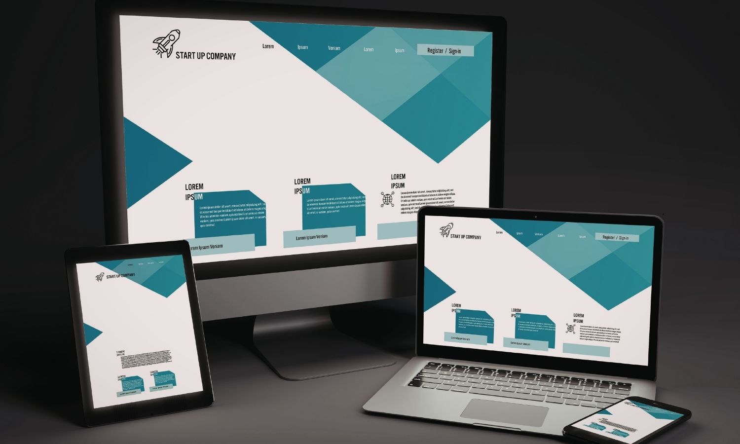
Responsive web design ensures that your website automatically adapts to any screen size, delivering a consistent, usable, and professional experience across all devices.
What Is Responsive Web Design?
Responsive web design is an approach to website design and development that allows layouts, content, and elements to adjust dynamically based on the user’s screen size and device.
Instead of building separate websites for mobile and desktop, a responsive website uses:
- Flexible layouts
- Fluid grids
- Scalable images
- CSS media queries
The result is one website that works seamlessly everywhere.
How Responsive Design Works
Responsive websites rely on a combination of design and code techniques that respond to the user’s device.
Key components include:
Flexible Grid Layouts
Rather than fixed pixel widths, responsive layouts use percentages and relative units. This allows content to resize smoothly as the screen changes.
Media Queries
Media queries detect screen size and apply different styling rules. This controls how menus, images, and sections behave on mobile versus desktop.
Scalable Media
Images and videos automatically resize to fit available space without breaking the layout or slowing performance.
Together, these elements create a fluid experience that feels natural on any device.
Why Responsive Design Matters for Businesses
Responsive design is not just a technical feature—it directly impacts revenue, credibility, and growth.
Mobile Traffic Dominates
More than half of global website traffic now comes from mobile devices. If your website isn’t mobile-friendly, you’re effectively turning away a majority of potential customers.
Better User Experience
Users expect websites to “just work.” Responsive design removes friction:
- No zooming or horizontal scrolling
- Clear navigation on small screens
- Readable text and tappable buttons
Better experience leads to longer visits and higher conversions.
SEO and Search Rankings
Search engines prioritize mobile-friendly websites. Responsive design supports:
- Mobile-first indexing
- Faster page load times
- Lower bounce rates
This makes it a critical foundation for SEO success. Businesses often combine responsive design with SEO-focused development strategies through partners like CodeZener, ensuring design decisions support visibility—not hurt it.
Responsive vs Mobile-Only Websites
Some businesses still rely on separate mobile websites (like m.example.com). While this was common years ago, it introduces complexity and maintenance challenges.
Responsive design offers:
- One website to manage
- Consistent branding across devices
- Better SEO performance
- Lower long-term costs
It’s a cleaner, more scalable approach for modern businesses.
Impact on Conversion Rates
Responsive design plays a major role in conversions. Even small usability issues on mobile—slow loading, broken layouts, confusing menus—can drastically reduce form submissions or sales.
A responsive website:
- Makes calls-to-action easy to tap
- Keeps checkout and forms simple
- Reduces abandonment rates
For e-commerce and service-based businesses, this directly affects revenue.
Responsive Design and Brand Perception
Users associate website quality with brand credibility. A site that looks polished on every device signals professionalism, reliability, and attention to detail.
On the other hand, a non-responsive website suggests:
- Outdated practices
- Lack of customer focus
- Poor digital maturity
First impressions happen fast—and responsive design helps ensure they’re positive.
Future-Proofing Your Website
New devices and screen sizes appear constantly. Responsive design prepares your website for the future by adapting naturally to new resolutions without needing redesigns.
This flexibility protects your investment and supports long-term scalability.
Common Responsive Design Mistakes
Some common pitfalls businesses face include:
- Hiding important content on mobile
- Overloading pages with heavy images
- Using tiny fonts or buttons
- Ignoring performance optimization
True responsiveness balances design, usability, and performance—not just layout adjustments.
Final Thoughts
Responsive web design is a foundational requirement for any modern business website. It improves user experience, supports SEO, boosts conversions, and ensures your brand looks professional everywhere your audience finds you.
In a world where customers move seamlessly between devices, your website must do the same. Responsive design isn’t a trend—it’s the standard.